AP Stat Candy Review so far – and a new one!

As of now, I have written 3 AP Statistics review activities centered around candy. You can access them all by clicking here. They are taking us around 2 class periods each, which is a full 160 minutes of class time; not a short commitment by any means, but I’m enjoying the long game connections a LOT.

Here’s a summary of topics I’ve covered so far:
Activity 1 – Skittles
This activity works itself up to chi-square goodness of fit tests (which, when I gave out this activity, we had not actually covered). Along the way we covered:
  • relative frequency tables
  • sample design, including
    • voluntary response sample
    • convenience sample
    • simple random sample
    • cluster sampling
    • stratified sampling
    • multistage sampling
  • collecting a sample and creating frequency and relative frequency tables
  • displaying categorical data with pie charts and bar graphs
  • two-way tables
  • marginal and conditional distributions
  • sampling distribution of sample proportions
  • confidence intervals for population proportions
  • 1 proportion z tests
  • Chi-square GOF tests
Activity 2 – Starbursts
This activity centered around a claim that the proportion of orange Starbursts is the same as the the proportion of orange skittles. We had never done 2-proportion z-tests, so the activity spends a lot of time walking through the logic of them and reviewing symbols and their meaning.
  • power of a test
  • calculating power (as an exercise in reviewing tests and CIs)
  • 1-proportion z tests (again)
  • 2-proportion z-tests
Activity 3 – M&Ms
In this one, we introduce quantitative data by measuring the mass of the M&Ms, while also reviewing some categorical data.
  • gathering data
  • review chi-square GOF with several possible distributions and sample sizes (exploring power, etc, along the way)
  • check percentage of actual rejected hypotheses against alpha
  • represent quantitative data visually and use SOCS
  • confidence interval for sample means
  • effect of sample size and alpha on power
  • 2-sample mean t-test
I honestly don’t know if this sort of long-range, vertical review is better than more traditional review or learning, but the students seem more engaged then I was getting them before, and I think they are grasping some of the big-picture conceptual things better than before, at least, which is satisfying for all of us. No idea if it will translate to AP scores.

3 Act Trial (and tribulations)

Inspired by the general enthusiasm for the process in the MtBOS, I tried my first 3 Act Math Lesson(s) today.

If this is somehow the first place you’ve heard that term, Dan Meyer has been the main force and originator of this structure, and I’ve also seen good explanations of the structure from Dane Ehler, Geoff Kraal, and many other. I think this series of blog posts by Dan Meyer is maybe the best place to really start understanding the structure.
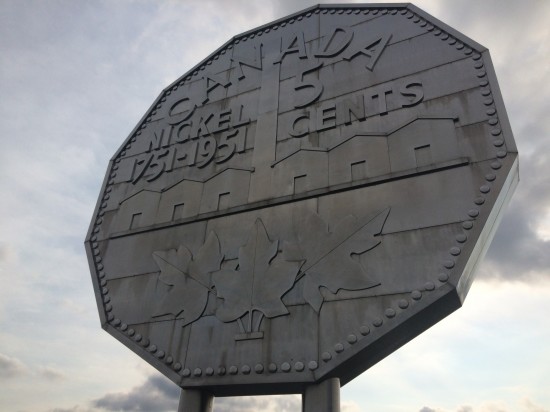
We just finished basic triangle trigonometry and word problems, and are about to start applying trigonometry to area, so I was looking for problems to help us hone in on those, and I found a couple: Boat on the River by Andrew Stadel and the Big Nickel task by Kyle Pearce and others. 
I had never done this before, so I decided to try something new and NOT overprepare. Didn’t make a handout, or a structure, or a OneNote page, or a powerpoint, or anything. Just watched the videos myself, made sure I understood the basics of what happened, and wing it.
It kind of worked.

Boat on the River 

Act 1

I told the students “We will watch a short video. Ask whatever questions you can about what you see.”
We watched the act 1 video three or four times and I elicited and wrote down questions.
Result from one class:
Some of the questions were silly (9), some were answerable by watching the video we had more carefully (1, 2, 12, 13ish, 10ish), some were ineffable (16), some required outside knowledge (11, from a student who sails), and MANY were math. I was going for #3, so that’s good. To solve!

Act 2

I showed them the pictures on the PDF provided by the task. 

(There is another image that establishes a scale for these pictures of 1 in = 10 ft). Since we already knew how to work with sine ratios, this was easy for the girls to work with, and they found that the boat will make it… barely. I let them work on this in partnerships for 5 minutes, explain their work, and then…
Act 3
We watched the Act 3 Video and clapped when the boat [spoilers!] made it through.

Overall outcome

A success. I don’t feel like the students were hugely more invested in this than in more “normal” word problems, but if I increase the enthusiasm of my presentation I think we can get there. I do like the basic structure, and calling for questions brings me back to the first steps of the Engineering Design Process from my science teaching days; a useful way to get ideas.

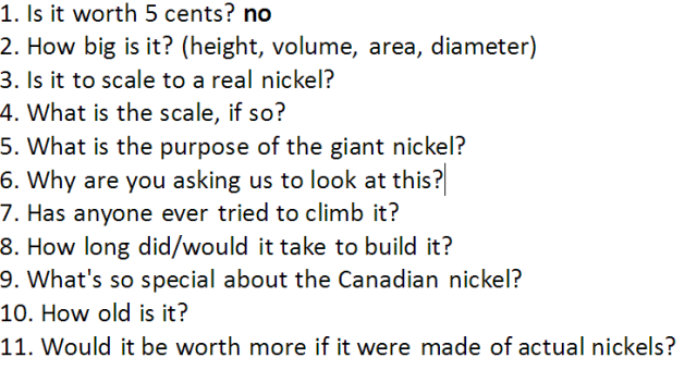
Big Nickel

Since we had never done area problems that required trig, this was a harder, longer task for my students, but that wasn’t the only stumbling block I ran into here.

Act 1

After watching the short video at the top of the task,  my students thought the monument was funny, but their questions were silly, snarky, and didn’t really go where I was hoping. I eventually had to straight up give them the question I was hoping for, the last one.
I don’t know how to inspire the sort of sideways silliness needed to find that question; a perfectly designed 3 act may do a better job of getting them there simply from the video, and maybe this one isn’t perfect. Or maybe I just need a sillier group of students to get there.

Act 2

“What do we need to know?” was actually more interesting here. We needed to know dimensions of the big nickel and the real nickel (height and thickness) and my students pointed out that we also needed to know if it were hollow  or solid – basically is this a problem about surface area or volume! This part was fun, as we scoured the wikipedia entry for the information we needed:
  • It is 9.1 m tall, 0.61 m thick.
  • It is made of steel plates attached to a skeleton – basically hollow!
  • A real nickel is 2.12 cm tall, 1.27 mm thick
I told them this was all they needed and let them loose. We have studied the area and angles of regular polygons before; I told them they may want to remind themselves of those formulas and techniques, as well as look for right triangles to use trig. I would say about 2/3 of each class got very close to finding the area of both the big nickel (in square meters) and the little nickel (in square cm). Some needed more hints and guidance than others. This part was slow, and frustrating, but went well. We got to the end of class and I asked how many nickels it would take to tile the front of the big nickel, and then we had to remember that square meters and square cm are not the same unit – so we got to review square unit conversions again, which we tackled earlier in the year. The math of this was good.

Act 3

… there isn’t really one. We can find other people’s solutions, but unfortunately there is no way to get the kind of satisfactory resolution from this problem that we got from the boat. I think this may actually disqualify this as a true 3-act problem. It is a GOOD problem, but, frankly, nobody has ever built the Big Nickel out of nickels, so we don’t have an answer to the question outside the theoretical.
How do you create the resolution of Act 3 when the problem at hand can’t actually be done?

TL;DR

My first attempt at 3 act problems was fun, and led to good math, but needs work. I think I need to add some structure, and I need to think more about some of the components, specifically how to get the resolution of Act 3 when the problem does not allow for it and how to get the “right” question out of Act 1 when it’s not necessarily obvious (but IS creative and interesting).

Soccer Goals – final thoughts

The Great Geometry Soccer Goal project ended a couple of weeks ago just before spring break, and I’m finally ready to finally debrief. I already wrote many of my thoughts at the mid-point of the project, so this one will be brief.

If you’re interested in seeing the products, here are the videos they made. They vary in polish, but all show the scope of the project well This was not the only product, but it is currently the only publicly available one; need to do some name removing, etc, before I can share snippets from reports or instructions.

If you want the project materials, they are here.

Was it worth it?
Yes. I may streamline it a tad to take 4 class days instead of 5 next year (our class days are 80 minutes), but it’s worth it either way.

Did they learn anything that will help with their test?
Probably not. We learned tangent ratios, and practiced the Pythagorean theorem and some arithmetic, but especially with spring break right after they still had to be retaught tangent on our return.

So what DID they get out of it?
Visual thinking with 3D shapes. Recognition of the practical value of certain math topics. Mathematical communication skills. Learning to use a saw. Value of precision, but also seeing where there is room for a little error. Fun! Honestly, though, i think the mathematical communication and 3D manipulation skills are probably the most “measurable” for a math class.

Changes?
I will probably use TinkerCAD next year instead of 3DTin, just because 3DTin seems to be a dying project, even though I prefer it a bit. I may skip the 3D modeling entirely, since it’s time consuming for the outcome, but I really like it so I’ll probably keep it. I will tweak the job assignments, but not much; my hard work in advance worked out well there. I will pray for no snow days. I may add other elements: have them calculate the cost of the goal using the Lowes website, for example.

I highly recommend this project, or one inspired by it, if you have the ability to buy and cut PVC with your students. It was a lot of fun.

The power of power

Today in AP Statistics we continued the Great Candy Review by comparing Starburst proportions to the skittles proportions; specifically, we started trying to decide if the proportion of orange starbursts could be equal to the proportion of orange skittles.

The activity covers both 1-sample proportion tests (by assuming that 20% of skittles are orange, as we surmised, and comparing our starburst sample proportion to 0.2) and then 2-sample proportion tests by dropping that assumption and comparing our actual samples, but before I dove into the tests I decided to spend some time dwelling on power.

This is my first time teaching this course, and I haven’t always figured out until too late what aspects to prioritize. Power is hard, it comes near the end of a chapter, and I skimmed it.

Big. Mistake.

Really thinking about the power of a test, even calculating it, turns out to be an extremely good way to really think about the underlying concepts of statistical inference. It took us 30-45 minutes to really get through the first two pages of the packet, which I didn’t expect, but I saw light bulbs going on all over the room as we slowly grasped the big picture. When students really understood the power of the test – when they realized that even if our friend is wrong there is a 75% chance we won’t be able to “prove” it with these techniques and understood why… well, they were obviously annoyed, but they also clearly understood the limitations and execution of inference tests better than they have all year.

It was a good moment.

Next class we will actually take a sample of starbursts and conduct the tests. I doubt we will be able to decide with high confidence that they proportions different (even though they really ARE) and now, hopefully, students will understand better why.

See this folder for the candy activities we’ve done so far.

Spring break is over: time for… The Candy Strategy

Spring break officially ends in a little under 12 hours, when my first class starts tomorrow. Naturally, tomorrow is the day in our rotating schedule where I don’t have a single free period, so it will be quite a change of pace.

Having just finished up our giant soccer goal geometry project, I’ve given myself permission to work a little less hard on that class for a week or two – my students will actually enjoy a trip into traditional math land, I think, and that will free me up to focus on AP Statistics (well, and the grades and comments that are due on Wednesday).

AP Statistics has not always one well for me this year, and I spent some time over spring break strategizing. I need to teach a few more concepts, help many of them fill in the gaping conceptual holes that our year has left behind, and give them plenty of practical test-taking strategies, all in 8 weeks. To do that, I need to re-establish trust and fun. Rapport. It needs to be a class they, and I, look forward to, and right now it just isn’t.

So, thus: the candy strategy.

I know I’m not the first to realize that statistics and candy go hand and hand – there are pages and pages of candy activities (with a special focus on M&Ms) on the internet. I read a lot of those, today. I think that I can piece together those ideas, along with some of my own, and review every single major concept we have learned with candy. Specifically, for me, a combination of jelly beans, starbursts, skittles, and M&Ms.

Today I wrote a 10-page document (see link at the end) that reviews frequency tables, pie charts, bar graphs, two-way tables, sample design, proportion confidence intervals, 1-sample proportion z-tests, and introduces chi-square goodness of fit tests as a cap, using nothing but skittles. We will work through the activity alone and in groups for the next two class days. Along the way we will review vocabulary, conditions, graphing techniques on calculator and by hand, and learn something new. Plus, eat some skittles.

It feels a little cheap, but I hope that candy will improve the relationship with my students enough that we can tackle this final quarter together with positive attitudes. One more to go!

Click here to access my folder of candy activities, including the very first Skittles Proportions activity.

Soccer Goals: mid-project check-in

Our geometry soccer goal project was scheduled for five 80-minute class days, but we lost a class day in every class due to snow. They were required to do some work on their projects at home during those days (we do “remote school” on snow days), but certainly not as much productive work was done.

On the whole, though, things are going well! All pictures below were created by students.
First, students calculated how long various pipes in our goal needed to be, given only “4 feet tall by 6 feet wide”
Then they calculated the angle they would need to rotate the diagonal beams:
The next day, we learned how to use the 3D modeling software 3DTin and built scale models of our goals. (click the image to go to the 3D model itself)
This 3D modeling software is a bit buggy (as they all are, apparently) and a couple of students have panicked or lost work, but most have handled it well. Some students didn’t put their pipes “inside” the fittings, so then their diagonals were too short and they had to troubleshoot. Others rotated the wrong angle – the student above, for example, rotated 53 degrees from the vertical rather than the horizontal at first and couldn’t figure out why the angles didn’t work. Good problem solving work to fix that.
The snow days came next, and students had to do what they could at home. Since the missed class day was going to be working on group projects, this was sadly little.
When we returned to class yesterday, though, we jumped right in!
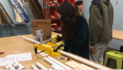
Every student measured and cut at least one piece of pipe while another student managed and helped them out. While that was happening, the students who weren’t working on the goal itself were taking videos and pictures (which is where these came from) and working on figuring out a set of instructions for assembly to distribute with the goals. 
By the end of class today, all of the pieces were cut and goals had been test-assembled in every class. I now have one more class day to help the girls finish their documentary videos and assembly instructions.
At this point, I think the project is a qualified success. 
Good Things
  • The right triangle applications were practical and useful, and it was helpful for them to see a use for tangents before learning about them.
  • 3D Modeling is in general a fabulous exercise in geometric thinking and coordinate systems, and when they ran into problems even more useful.
  • They are learning to use saws safely, always a nice skill. Also, “measure twice cut once”.
  • While making their videos, they have to work out the best way to present the mathematics of their goals, aiding mathematics communication.
  • Making explanatory diagrams is always a useful task in STEM communication and, I believe, quite mathy.
Things to fix or add next year
  • Technically topical or not for a geometry class, I want to add budgeting for supplies to the project.
  • The video product won’t really come together well, I fear, and the time devoted to it isn’t particularly intellectual for many of them. Need to adjust it a bit or a lot.
  • If possible, it would be nice to open the design options a little wider to give them more ownership of the project design. Give them even less. If I pepper the project pieces over the whole quarter that could be more tenable.
  • 3D Modeling is awesome, but would be better if we’d done something earlier with the software so less time needs to be spent on that. Find a way to introduce the software in first semester.

The AP Conundrum

I am teaching AP Statistics this year, and, in general, really like it. I have a science background as much as a math background, so statistics is very appealing to me, and I honestly do believe that it is more important and useful than calculus for many, many people. Plus, I think it’s fun!

My conundrum is with the AP curriculum itself. Y’all, it is so. packed.

I am sitting in the room right now watching my students taking a chapter test that covers 1-proportion Z-tests, 1-sample T-tests for the mean, and (most difficultly) the interpretation of all of the various points and numbers that come up in the process of taking those tests. This test will probably have an average (raw) score in the 65% range, though I do curve it (as the AP test itself is curved).

We had five class days to work on this chapter. 400 minutes of class. This isn’t nothing, of course, but it simply. isn’t. enough. to explore these in a way that helps them really grok what’s going on. And slowing down is not really a viable choice if we want them to have a chance of getting the questions that come up from chapters 10, 11, and 12.

So they muddle through. They learn trigger words that remind them which calculator command to use where, and they memorize phrases like “We are 95% confident that…[this thing] is not [that thing]” and they cram, cram, cram. I have excellent students who work very hard, and none of them are in danger of failing the class, but they aren’t enjoying it. And, perhaps worse, most of them won’t remember it or apply it.

Part of that is me – this is my first year teaching it, so I muddle about quite a bit, usually don’t figure out the best way to explain things and frankly I don’t think I did a great job in the first couple of chapters setting up the overall meaning of statistics and really hammering the concepts when the numbers were easy. That would have made the interpretation parts simpler now. Next year will be better.

And part of it is the weird position AP stat takes at our school (and many others, I tihnk) – it’s the “easy” AP math, right? Well, sort of. It’s definitely not hard in the same way that AP Calculus is, but it is PLENTY hard. Doing well on the tests requires a higher level of logical thinking and explanation skills than calculus, but it doesn’t require the same level of comfort with numbers and formulas (though it requires some!) So it’s easier for some people, but not all. However, the rest of my department doesn’t necessarily understand that, and our recommendation process doesn’t really know how to screen for who will be ready for the class, so I have several who, simply, aren’t.

But a big part of it is the AP curriculum itself. We are required to submit a syllabus that includes projects, but mine was/is thoroughly shoehorned in and non-rigorous, because there simply isn’t TIME. We’re not going to get through the last chapter as it is! And that is sad. If there is any class that is ripe for project-based-learning, it is statistics, but there is simply no possible way  to do it that way with any primacy inside the AP curriculum. There’s too much on the test.

AP Physics B used to have a similar problem, and the AP committee, bless them, eventually split it into two years to allow for more exploration and depth. I don’t think that’s necessary for AP Stat, I think we just need to cut some things. I’m not sure what we could cut – that’s not really my decision – but as it is, there is too much to do in one year, even with extremely intelligent, hardworking students with great mathematical backgrounds. I don’t want to go shallower, I want to deeper with less.

I think I will find a way to compromise, for this year. I can look through the last two chapters, write up a summary and sample questions that hits the absolute basics of them for the test – basically, intentionally go very shallow on those, expecting that students will miss some of the harder questions on those topics – and then spend time looking deeper at our earlier chapters. It might result in the same test scores, and may revitalize my faith in the curriculum.

Does anybody else have this problem? Suggestions on how to get some depth of understanding without compromising their test scores?


The Dress – Why do I see the wrong colors?

By now, you have seen the dress. This dress, by the way, is undeniably, and actually, Blue and Black.

If you’re like me, you see White and Gold (in shadow!) If you’re like many others, you see Blue and Black. If you’re like some, you see Periwinkle and Gold. But the real dress has been confirmed as blue and black.
What’s also undeniable is the colors of the ACTUAL IMAGE are a light purply blue and a brownish orange – so arguably blue but definitely not black.
So there are three  questions here:
  1. Why did the camera screw up so badly, as those colors are clearly NOT the darkish blue and black the dress is supposed to be? How is it possible that the camera did such a bad job?
  2. Why do my eyes/brain see the white and gold, even though it’s really blue and brown?
  3. Why do other eyes/brain see the blue and black it actually is even though the picture is terrible?
Here is my theory for question #1. The dress is indoors, in a store perhaps. The area behind the dress and camera is lit with bright incandescent lighting. The area in front of the camera and dress is lit by the sunlight we can see in the photo streaming in from the upper right.
When you take a photo with a camera in automatic mode, it has to make two big decision: what kind of light is it in and how much light should it “suck up”. These are called the “white balance” and the “exposure.”
This camera saw the sun and said “Oh! Sun! I’m in daylight!” and set the white balance to daylight. Since the sun is kind of bluish and incandescents are kind of reddish, this means that the image will be shifted a little bit redder under daylight than incandescent, so making the WRONG decision here means that all the colors in the dress shifted red: the dark gray (not black, really, because it’s shiny) of the trim shifted toward brown, and the blue of the main fabric shifted toward purple.
The camera ALSO realized that it needed to get a bunch of extra light, since otherwise we wouldn’t be able to see the dress in contrast with the bright sun, so it cranked the exposure up. This resulted in everything – the black and the blue – being brighter than they really should have been.
End result? A black and blue dress looks light purple and brown.
Here’s my proof:
I printed some blue and black stripes, taped it onto an opaque file folder, and put scotch tape all over it to make it a little shiny (the dress is shiny!). 
Here is the original image and the printed out version taken with automatic options under good light.

Here is the same card, photo taken with bright incandescent lighting – however I manually set the camera to daylight AND overexposed it. In other words, I think THIS is what the camera did wrong to get the image we got.
I think that no matter WHO you are you can interpret that as potentially being white and gold! If anything I exposed it too much.
Okay, so that helps answer the question of “why does the picture look so bad?”
Second question – why do I see something even worse? After all, the actual photo is light blue and brown, and I see white and gold – even further away from the true value. This one I can’t prove, but my theory is that my brain is doing the same thing the camera did, and, just like the camera, getting it wrong. 
When white things that are lit by daylight are in shadow, they actually look a little bit purple. My brain is smart. It says “Oh, look, it’s in shadow, so that means it will look a little bit purple even if it’s white. Therefore, I’m going to assume those purple bits are actually white, since the position of the sun makes me believe the dress is in shadow.” My brain also assumes the brown bits are shadowed, so it lightens them up and gives them some shininess, creating the illusion of gold.
In other words, I THINK the picture below is what I’m seeing. This picture is a white-and-gold card, in the daylight, but shaded.
But I’m not.
Third question – why do some see it the right way, and others flip back and forth? Well, this one is harder. I think this particular picture is amazing because it somehow managed to find that perfect middle zone of perception where things can go different ways. Some of our brains do what mine did and make the wrong call about lighting, making the bad picture even worse, Some go the other way, and make the right call, so their brain “fixes” the bad picture. This is what most of our brains do with most pictures – we are CONSTANTLY “fixing” bad pictures in our heads, and some people still get this one right. Others go either depending on the moment, light in the room, brightness of the display, or other factors. It’s in a gray zone. Personally, I’ve only managed to make the original picture look blue and black once – it was by projecting the image, zoomed in, on a white board, in a dark room. Suddenly it looked blue and black to me. Otherwise, I have always seen white and gold.
What makes this more frustrating ans simultaneously appealing than other optical illusions is simply that this one was a complete accident! Usually, to be this confusing, illusions have to be designed. 

Huge soccer project about to take off!

Inspired by this post from Geoff Kraal, I am going to spend the next five class days (80 minutes each) plus homework time working on a large-scale project in which my three geometry classes will build small, child-size soccer goals out of PVC pipe. When we’re finished, the goals will be given to faculty children (including one goal for mine!)

The students will be broken into groups of 6 to 8. Each student will, individually:

  • Decide what size pieces of PVC they will need using the Pythagorean Theorem for the diagonals
  • Figure out the angle they need to rotate the diagonal pieces using tangent ratios
  • Create a scale 3D model of the diagram using the online 3D modeling software 3DTin. I will provide them with this template for the fittings. This will require them to work and think in three dimensions, of course, as well as deal with scaling.
  • Write a report explaining all of the above, with extra focus on the mathy bits.
The whole group will then break into subgroups to accomplish the big three group goals:
  • Create the goal itself. Every student will measure and cut at least one piece, while one student manages the process.
  • Make a video documenting the design, building, and assembling process. Several students will work on this as writers, editors, and videographers. (Mathematical communication)
  • Make a document that contains instructions and diagrams for assembling the goal from the components, since some of our goals will be given to faculty members for their children in disassembled form.
We are lucky that we have a brand new maker space on campus where we can do the measuring and cutting with support from excellent staff members.
I’ve spent a TON of time trying to think through the organization and group job assignments that can make this effective, so I’m crossing my fingers that it goes well. It’s a big risk because in terms of “testable content” we are not doing much new in these five days – really, tangent ratios, a 15-minute mini lecture, is all we’re getting in that domain – but I think it will be an extremely valuable general STEM project. I’ll let you know in a couple of weeks.
You can access all of the support documents I’ve created for this project, including some instructions on using 3Dtin and job descriptions for the sub projects, in this shared folder on Google Drive. The .one file is the original – I created these documents using OneNote, which I use to distribute all notes and handouts to my students, but it is also available in Word (may have formatting issues) and PDF if you prefer.

Now I have to assess this unit…

…and I really don’t know how.

The problems are great, but I’m not comfortable (yet, I hope) grading them as high-value summative assessments, which means that I don’t have a “reasonable” distribution of grades. I could spend a day consolidating our knowledge from the problems and short-lectures – areas of various shapes, similarity theorems, scaling factors, area unit conversions – and throw together a quiz on it, but it just feels so… blah. This is always my issue when I get excited about process, is that grading process is hard and never feels fair, but of course it’s expected that I will have a reasonable semi-normal grade distribution, and the students who will eventually struggle with SAT/ACT/etc math should probably be at my low end. So I need a quiz.

I don’t want to do a quiz.

It’s probably what I’ll do, though.